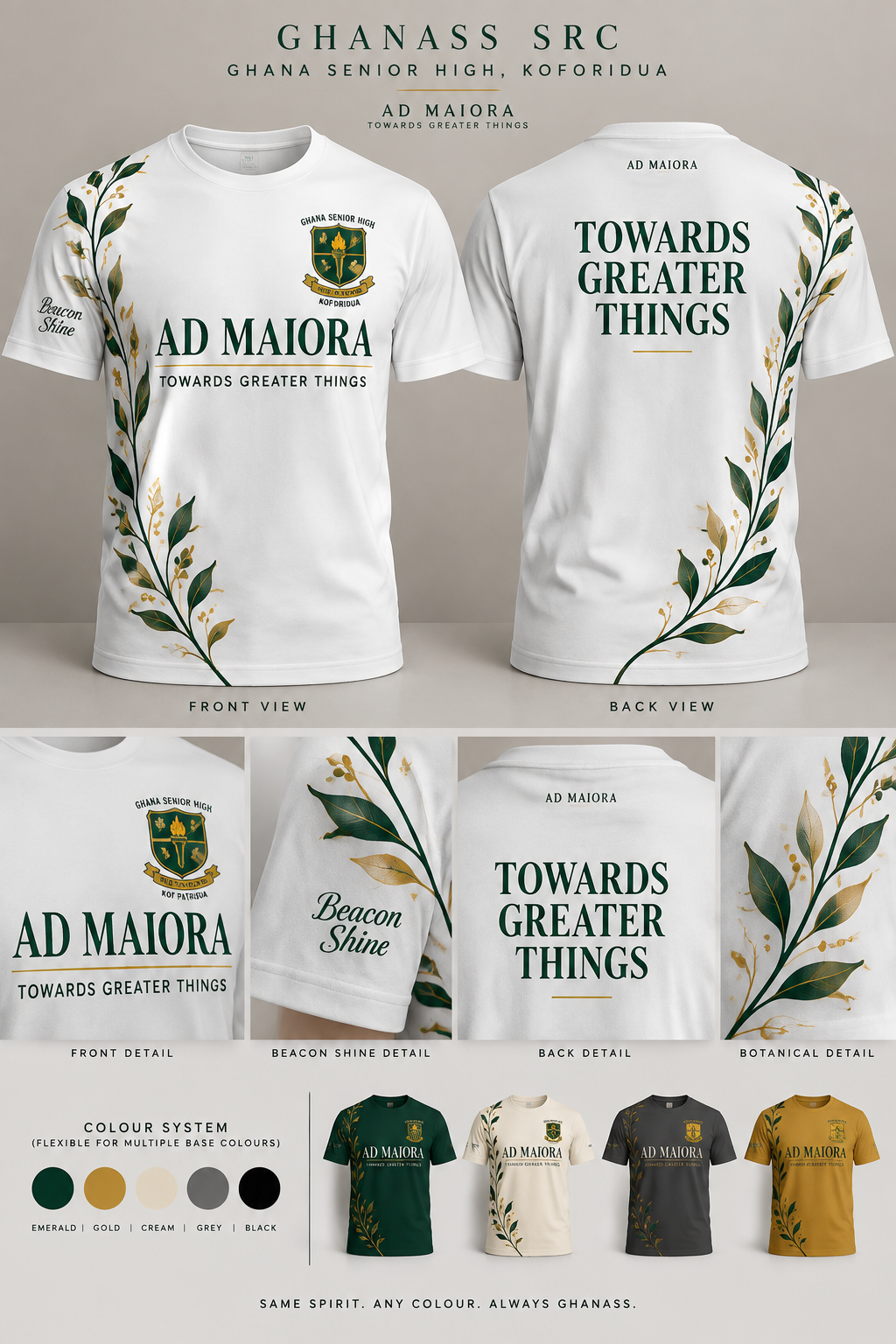
Absolutely — here’s a strong master prompt you can paste into another AI image/design tool. 🔥 GHANASS SRC — AD MAIORA T-SHIRT MASTER PROMPT > Create a premium fashion-forward T-shirt design for the Ghana Senior High School, Koforidua (GHANASS) SRC. Use the uploaded blank white T-shirt image as the exact garment base and preserve its realistic shape, proportions, collar, sleeves, and fabric texture. The shirt is 100% cotton and should look like a professionally manufactured premium school/SRC fashion piece, NOT a conventional event T-shirt. FRONT DESIGN: Place “AD MAIORA” prominently across the upper-middle chest in an elegant, sophisticated high-contrast serif typeface. AD MAIORA must be noticeably larger than “TOWARDS GREATER THINGS.” Directly beneath it, place “TOWARDS GREATER THINGS” in a clean, bold, highly readable modern sans-serif font, still large enough to be clearly visible. Integrate the official Ghana Senior High School, Koforidua crest tastefully near the upper chest without overpowering the typography. Add “BEACON SHINE” below the left arm/underarm area in an elegant flowing script or refined italic typeface, keeping it readable and sophisticated. CONTINUOUS BOTANICAL DESIGN: Create a single elegant curved botanical/vine line that begins near one side of the front shoulder/upper sleeve area, flows naturally down the side of the shirt toward the lower front hem, and visually continues around the side onto the back. Add small refined leaves and delicate branches along the curve. The botanical elements should feel premium, minimal and sophisticated — never cartoonish, childish, or overly decorative. BACK DESIGN: At the upper back/neck area, place “AD MAIORA” very small and subtle. The main back statement must be “TOWARDS GREATER THINGS”, displayed prominently in large, bold, elegant typography. The continuing botanical/vine line should flow diagonally or organically around the back and connect visually with the front design. COLOUR SYSTEM: Use a refined GHANASS-inspired palette: deep emerald/forest green, elegant gold, warm cream, and white. The design must have enough contrast to remain readable and visually attractive when adapted to other T-shirt colours such as black, emerald green, cream, grey, and gold. Prepare the artwork as a colour-flexible design system rather than something dependent only on a white shirt. STYLE: Luxury collegiate fashion × modern African school identity × sophisticated SRC merchandise. Minimal, elegant, youthful, premium, clean, confident and wearable. Avoid excessive graphics, excessive text, random shapes, giant logos, cartoon elements, gradients that reduce readability, or a typical school-programme/event-shirt appearance. TYPOGRAPHY HIERARCHY: 1. AD MAIORA — largest and most elegant on the front 2. TOWARDS GREATER THINGS — clearly readable and substantial 3. BEACON SHINE — smaller decorative accent 4. AD MAIORA — tiny on back 5. TOWARDS GREATER THINGS — dominant statement on back IMPORTANT: Keep all spelling EXACTLY as written: AD MAIORA, TOWARDS GREATER THINGS, BEACON SHINE, GHANA SENIOR HIGH, KOFORIDUA, PRO PATRIA. Do not invent additional slogans or text. Make the typography crisp and correctly spelled. PRESENTATION: Generate a professional front-and-back apparel mockup on a clean neutral studio background, with realistic cotton texture, natural folds, subtle shadows, accurate print placement, and premium fashion-catalogue presentation. Also provide close-up views of the front typography, BEACON SHINE detail, back typography, and the continuous botanical design. FINAL FEEL: This should look like an official GHANASS SRC fashion collection piece that students would genuinely want to wear — sophisticated enough to look like premium streetwear while still clearly representing AD MAIORA — TOWARDS GREATER THINGS.
See More
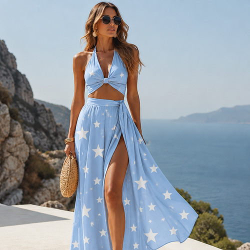
Colour is beby blue and star
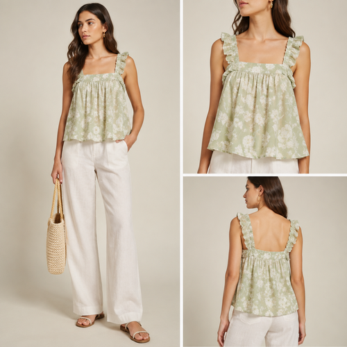
A Female Top design, suitable for Summer. VE fashion aesthetics. Present it as professional fashion catalogue photograph...
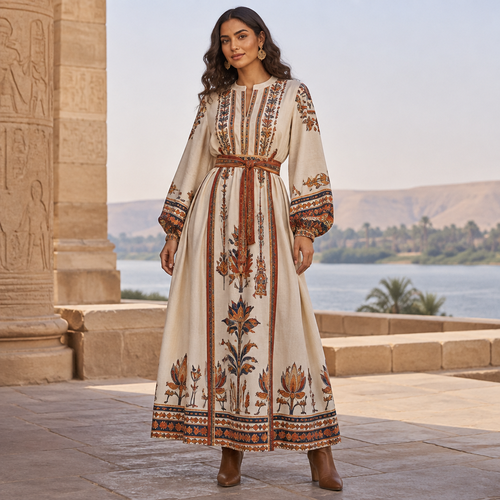
A Female Dress design, suitable for Fall. Consider Egyptian fashion — flowing silhouettes, vibrant colors, cotton and li...
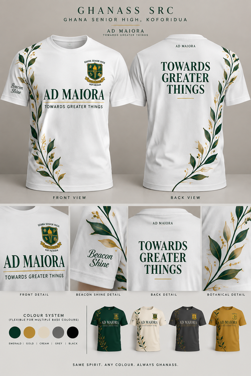
Absolutely — here’s a strong master prompt you can paste into another AI image/design tool. 🔥 GHANASS SRC — AD MAIORA ...
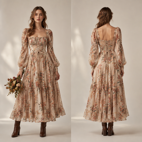
A Female Dress design, suitable for Fall, in Bloomcore style Present it as professional fashion catalogue photography: t...
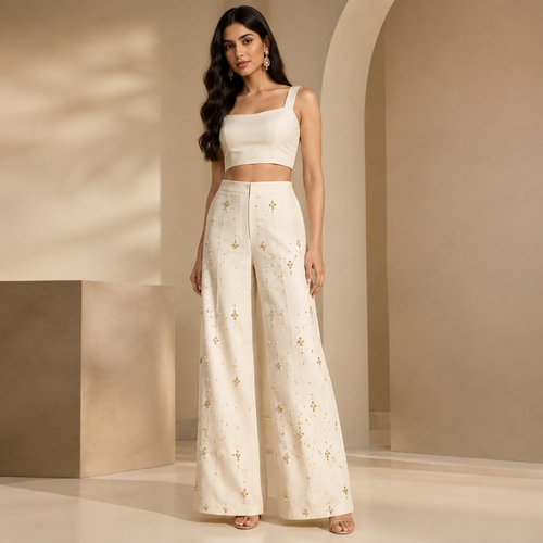
A Pants design. add some white and yellow stones Present it as professional fashion catalogue photography: the garment i...
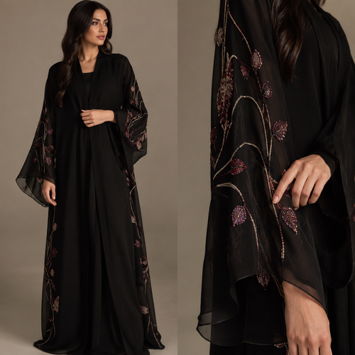
ابا عباية أعراس بس مب ثقيل شي خفيف عباية سوده عليه شغل بلون اي لون من عندك بس يكون حلو و مميز
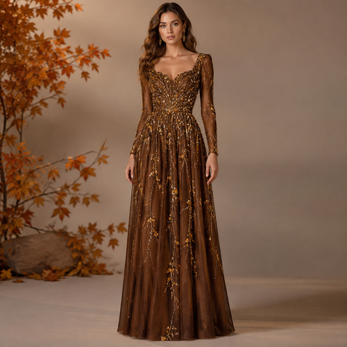
A Female Dress design, suitable for Fall. can we add some white and yellow rinestones Present it as professional fashion...
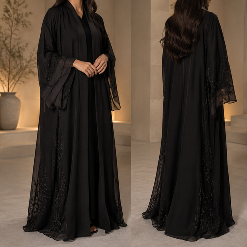
ابا عباية أعراس بس مب ثقيل شي خفيف عباية سوده
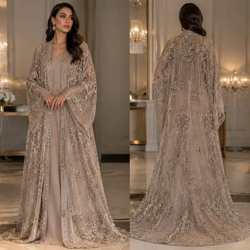
ابا عباية أعراس وقماش أعراس فيه كله شغل
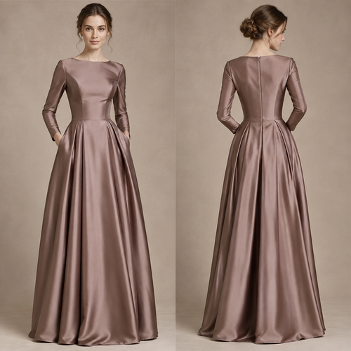
A Female Dress design, made of Silk, with a sleek, smooth finish, with a Tailored silhouette, suitable for Fall, in Eleg...
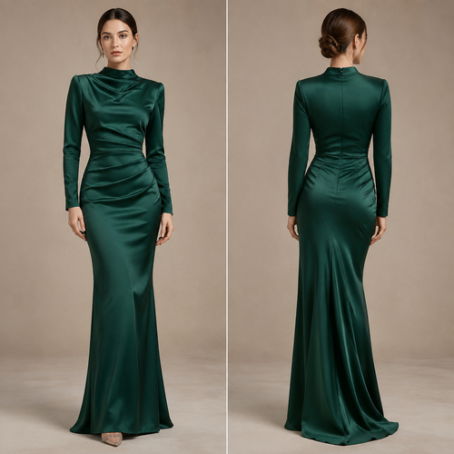
A Female Dress design, made of Satin, with a sleek, smooth finish, with a Bodycon silhouette, with modest, full coverage...
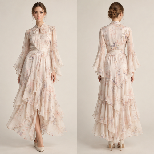
A Female Dress design, made of Silk, with a light, flowing drape, with a Tailored silhouette, styled in layers, in a Pas...
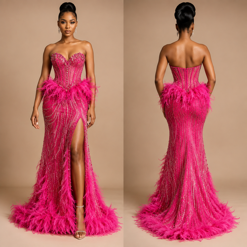
A Female Dress design, suitable for Spring, in Classic style. a dress like this formed into a corset with feathers aroun...
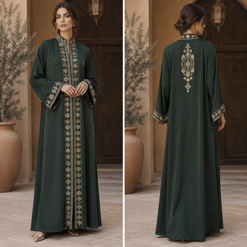
A Female Dress design, with modest, full coverage: longer hemlines, higher necklines and covered shoulders, suitable for...
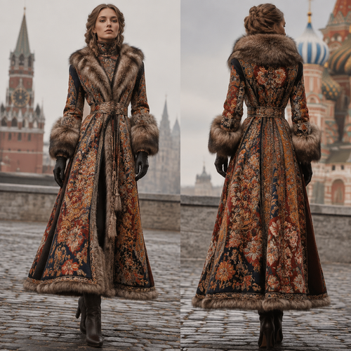
A Female Dress design, suitable for Fall. Consider Russian fashion — fur and layering traditions, bold patterns, mix of ...
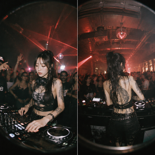
wide shot of asian tattooed female dj at age 20 is dj-ing at bar, there are group of people vibing on the back, nightlif...
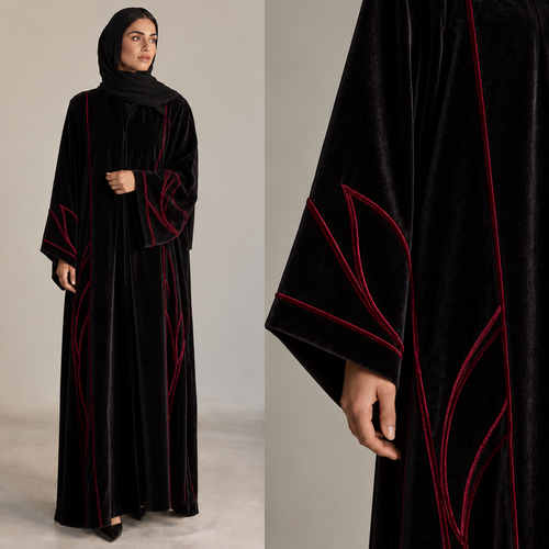
خامه القماش مخمل
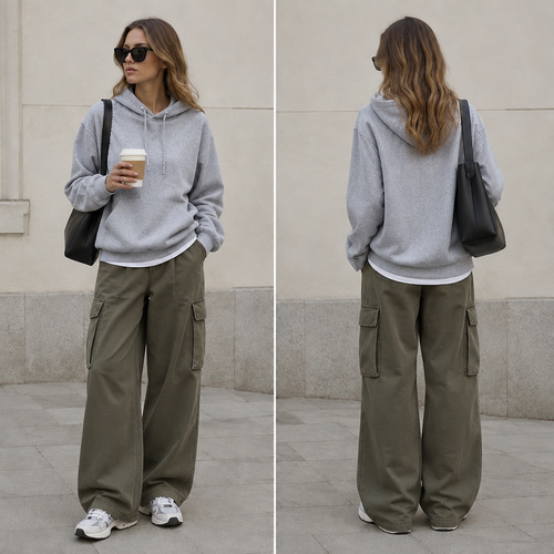
Street wear
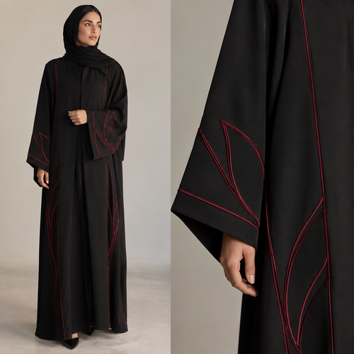
التطريز لون عنابي
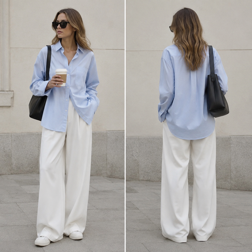
young woman standing still against a minimalist cream wall, oversized powder blue shirt and wide-leg white pants occupyi...
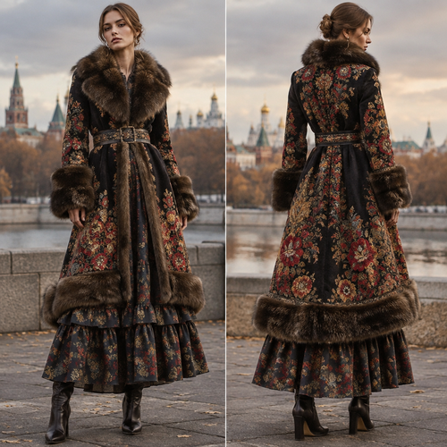
A Female Dress design, suitable for Fall. Consider Russian fashion — fur and layering traditions, bold patterns, mix of ...
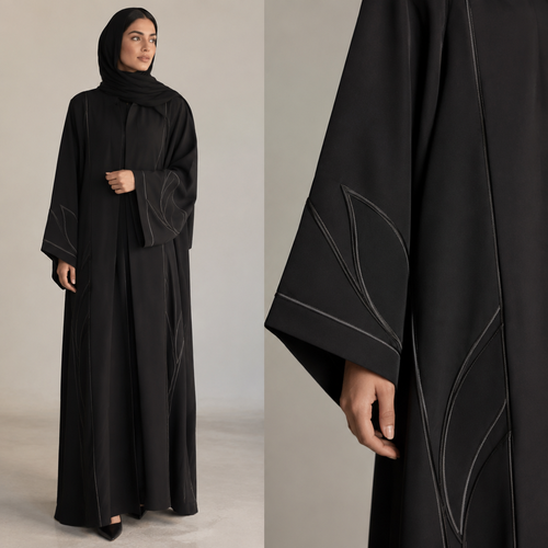
عبايه
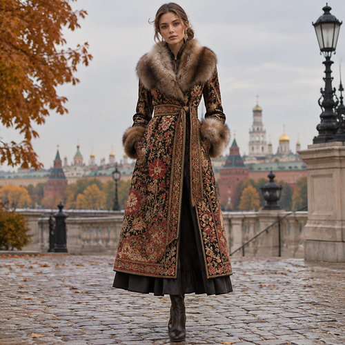
A Female Dress design, suitable for Fall. Consider Russian fashion — fur and layering traditions, bold patterns, mix of ...
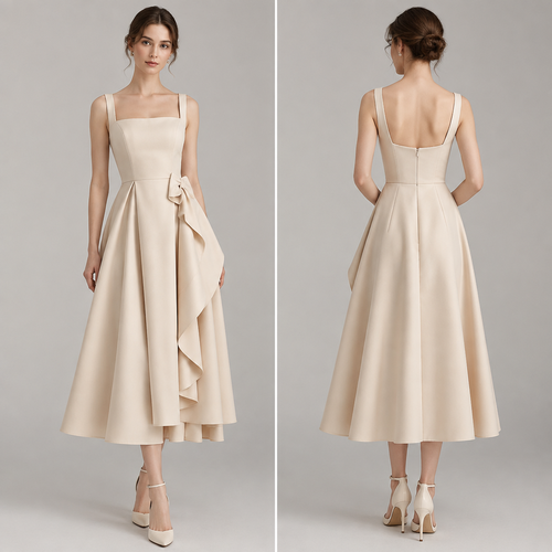
Elegant
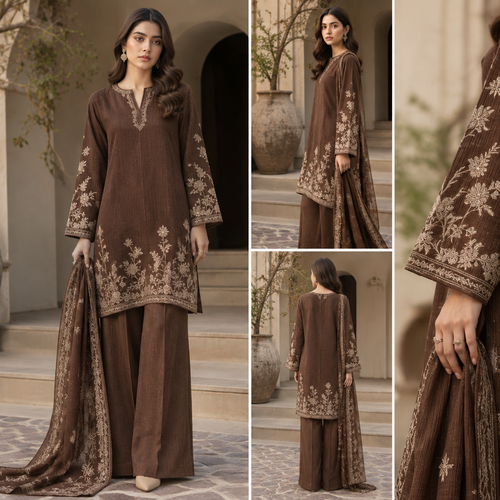
A Female Dress design, suitable for Fall. change this stuff silk into cord set. Pakistan fashion aesthetics. Present it ...
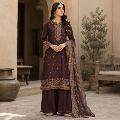
A Female Dress design, suitable for Fall. Consider Pakistani fashion — shalwar kameez, gharara, sharara; lawn fabrics, c...
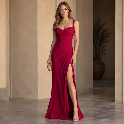
A Female Dress design, with a Tailored silhouette, in a Bold & Bright color palette, for Date Night, shown on a model wi...
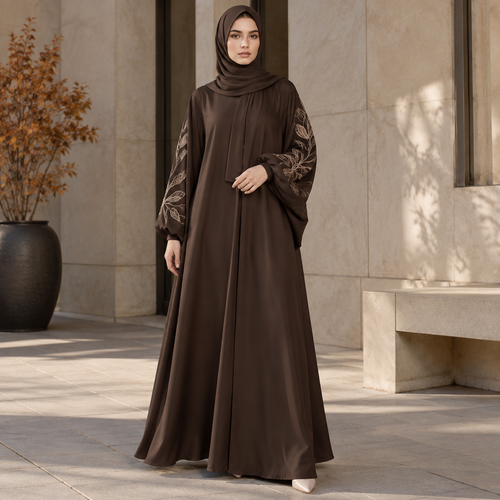
A Female Abaya design, with a Flared silhouette, suitable for Fall, shown on a model with fair skin. LY fashion aestheti...
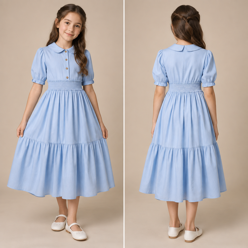
فستان اطفالى سن ١٠ سنين لونه لبنى بنص كم بزارير عند الصدر واستك عند الوسط وجيبه واسعه. Egypt fashion aesthetics. Present...
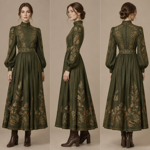
A Dress design, with modest, full coverage: longer hemlines, higher necklines and covered shoulders, suitable for Fall. ...
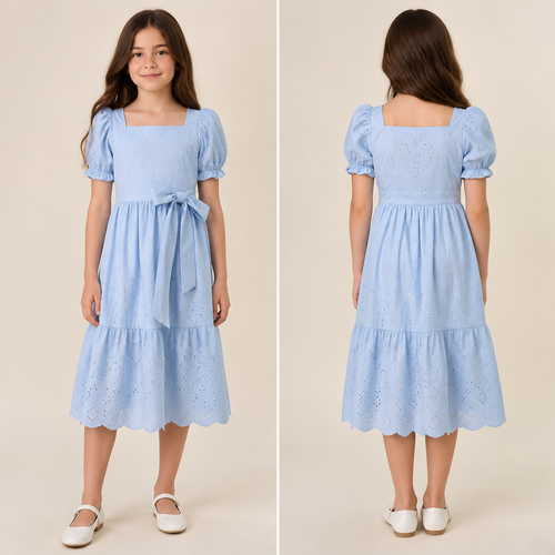
اطفالى عمر ١٠ سنين لونه لبنى صيفى نص كم تحت الركبه. Egypt fashion aesthetics. Present it as professional fashion catalog...
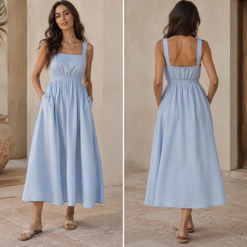
A Dress design, made of Linen, with an Oversized silhouette, for Casual, suitable for Summer, in Casual style, shown on ...
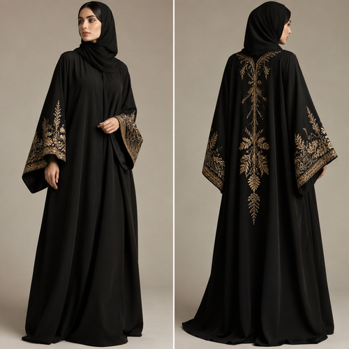
Black abaya, oversized silhouette, wide sleeves, elegant gold embroidery around the cuffs and back.
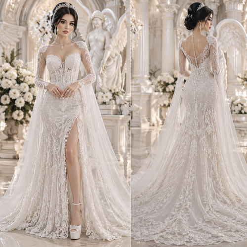
A lady wearing a long beaded lace gown . The color of the dress should be white . Her hair is black like a bridal hairst...
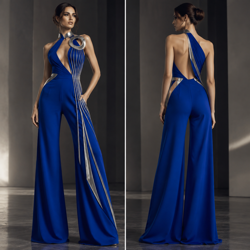
Using the uploaded reference image as a design inspiration, create a completely original women's high-fashion evening ju...
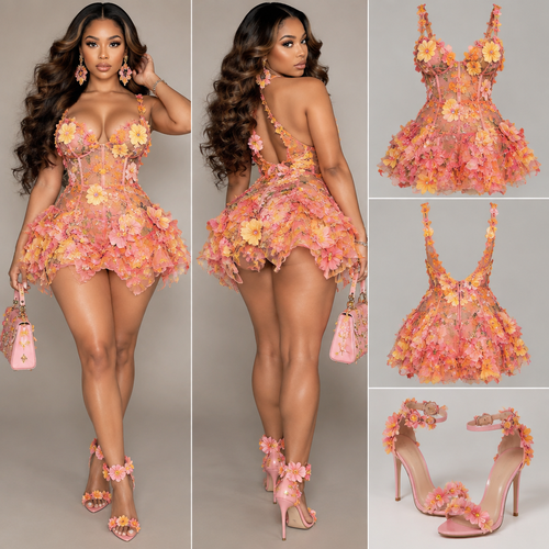
A lady wearing a short flower mesh dress. The color of the dress should be a mixture of pink and yellow and a little tou...
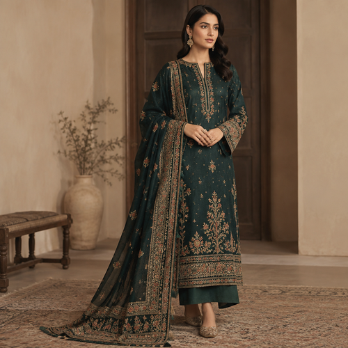
A Female Dress design, suitable for Fall, in Elegant style. Pakistan fashion aesthetics. Present it as professional fash...
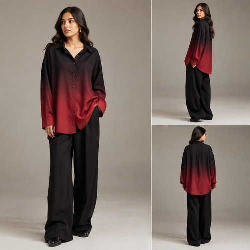
I want to make button down shirt with gradient colour like mixing red and black simple oversize button down shirt. Pakis...
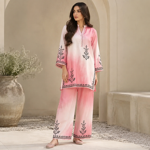
A Female fashion design. I want to make a shirt with pink and white shaded mixing and same trouserwith some simple black...
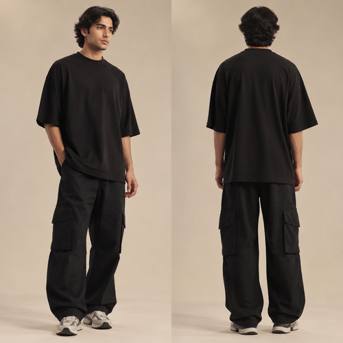
A Unisex Activewear design, suitable for Fall. I only want to make oversize t shirt in black color. Pakistan fashion aes...
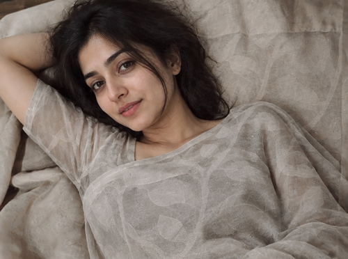
Outfit try-on